
Quantifying the Strat
Spotting high probability setups

Most traders chase certainty. They want that clean, simple rule : hammer equals up, shooter equals down, 2u equals continuation. That tidy signal that tells them what to do next with absolute certainty.
But anyone who has traded for more than a week knows that’s not how it works. Hammers fail. Shooters get shrugged off. That “perfect” 2u continuation can stall immediately and roll over.
It’s frustrating. If we’re honest, a little humbling.
TheStrat gets really interesting when you stop asking ‘what pattern is this?’ and start asking ‘what’s the probability of what comes next?’ That shift sounds subtle, but it changes how decisions get made. You begin to think in odds rather than fixed setups, shifting the conversation from certainty to likelihoods; from opinion to probability.
That’s where a first order Markov chain model comes in. Run SPY through it, map how one Strat scenario flows into the next across different timeframes and suddenly you see the granular probabilities:
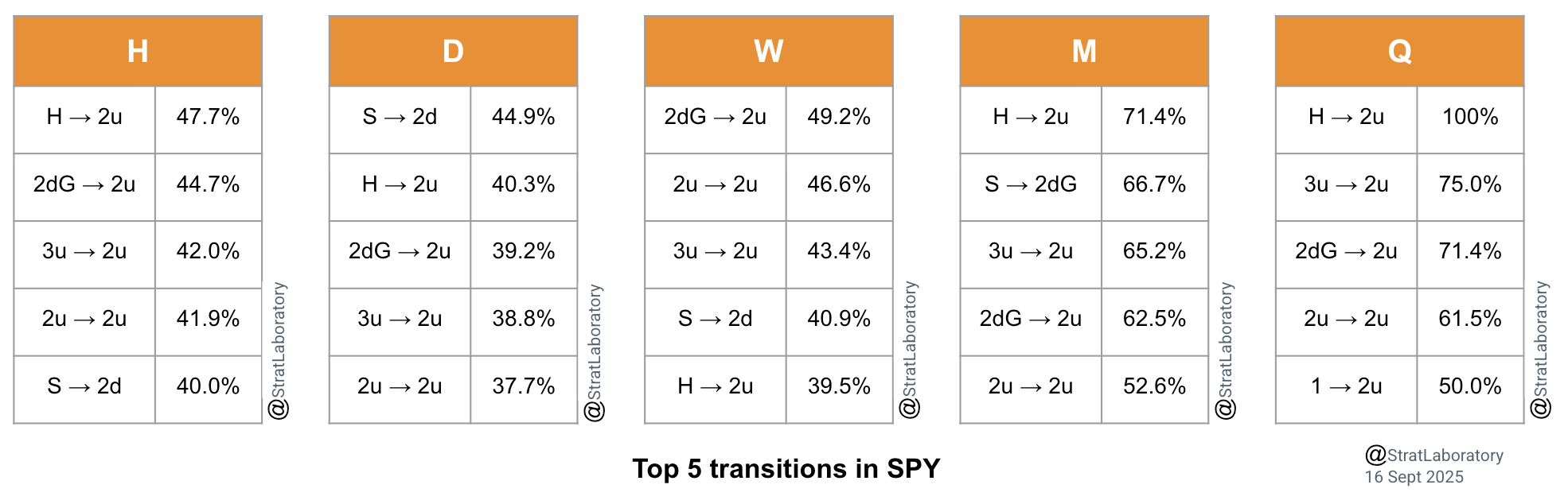
On the hourly chart of $SPY, a hammer becomes a 2u around 47.7% of the time, on the daily it’s closer to 40.3%, on the weekly about 39.5%, on the monthly it jumps to roughly 71.4% and on the quarterly it clocks in at 100%. (To be taken with a pinch of salt as it’s only happened once in a sample size of 130 quarterly candles on the SPY).
In this article, I’ll break down the top 5 transitions across hourly, daily, weekly, monthly and quarterly charts; leaving you with edges you can take straight into the market and start testing in your own trading.
TheStrat and Markov chains
If theStrat is new to you, it essentially boils down price action into three scenarios:
1 = inside bar (price stays within the prior candle’s range)
2u = “two up,” breaks above the prior high
2d = “two down,” breaks below the prior low
3 = outside bar, takes out both the high and the low
That’s the clean textbook version.
In practice, it helps to refine the states so they map to what really shows on a chart. To that end, I’ve made a few tweaks
Split 3s into
3u (outside bar finishing up)
3d (outside bar finishing down)
Separated failed 2s:
2dG (2 down but green close)
2uR (2 up but red close)
Add the common reversal shapes:
H (Hammer)
S (Shooter)
These tweaks don’t change the philosophy, they just give more precise handles for behaviour that Stratters already talk about.
Now, what happens when these states are run through a Markov chain?
You get something called a transition matrix.
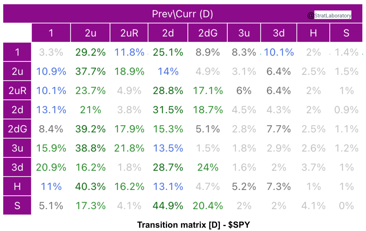
Think of the transition matrix as a 2-dimensional table. Along one axis you’ve got the current Strat scenario (what just happened), and along the other axis you’ve got the next Strat scenario (what tends to happen afterward). Each cell in the table tells you the probability of moving from one setup to the other.
So if you look at the row for ‘Hammer,’ you can scan across and see the odds of it turning into a 2u, a 2d, a 3, and so on. It’s basically a probability map of what follows what
Here’s the transition matrix for SPY on the daily timeframe
Across every timeframe, certain Strat setups repeat with the highest probability. Here are the top 5 transitions you’ll want to keep on your radar.
The transitions themselves are interesting, but the bigger story is what they reveal about how setups evolve across timeframes. Here are some key takeaways.
1/ All Hammers aren’t equal: noise vs conviction
The first and most obvious result: hammers resolve upward (H → 2u) across every timeframe. But the strength varies dramatically:
Hourly. : 47.7%
Daily. : 40.3%
Weekly. : 39.5%
Monthly. : 71.4%
Quarterly. : 100%
So, yes, hammers lean bullish, but the edge scales with the timeframe.
Treat an hourly hammer as a trade idea, not a statement of fact and reserve conviction for the monthly or quarterly trend.
A hammer that forms at the bottom of a broadening formation on the hourly might be interesting, sure, but a hammer that forms near the monthly open and holds above it into the next month is a different animal. One asks for nimble risk, the other deserves a plan to stay in as long as the structure says “still valid.”
2/ 2dG: The springboard setup
The transition 2dG → 2u is one of the most reliable across all frames. “2d but green” (downside attempt, closes higher) is a clear sign of buying pressure stepping in.
Hourly : 44.7%
Daily. : 39.2%
Weekly : 49.2%
Monthly : 62.5%
Quarterly. : 71.4%
The takeaway isn’t “always buy 2dG.” It’s that 2dG seems to plant the seed for trend continuation and that seed tends to grow when there’s more time for the algos to do their work.
If trading intraday, fine, use it, but the higher the timeframe, the more this setup looks like a proper launchpad rather than a one candle fluke.
Worth noting: Similar to the hammer above, 2dG near a major weekly pivot or just below the monthly open that then reclaims it can act like a tripwire. That reclaim isn’t just a line on a chart; it’s a sign that the auction flipped and the path of least resistance may now be higher.
3/ Shooters don’t scale the same way
Shooters (S) resolving into 2d’s show up in the top transitions, but their behaviour is irregular:
Daily. : 44.9% (top transition)
Weekly : 40.9%
Monthly : 66.7% (very strong)
Quarterly. : not in the top 5
If shorting with shooters, treat them as situational. Layer in where they appear in the broadening formation, how they sit versus VWAP or the monthly open, and whether a simultaneous break is lining up, otherwise the edge can vanish as soon as liquidity hunts both sides. A shooter that triggers under a monthly open when sector leaders are also breaking down carries different weight than a shooter floating mid‑range while the index is bid.
4/ The strange case of 3u → 2u
Here’s where things get interesting. A 3u candle looks like exhaustion: an outside bar to the upside, often interpreted as a potential top. Whist this is true on lower timeframes, the data says otherwise, especially on higher timeframes:
Hourly. : 42.0%
Daily : 38.8%
Weekly. : 43.4%
Monthly. : 65.2%
Quarterly. : 75.0%
Practically, that means a 3u isn’t an automatic fade. It’s a “prove it” bar.
If the next candle goes 2u and the higher‑timeframe bias is already pointing up, continuation is more likely than the textbook would have us believe.
5/ Trend persistence: 2u → 2u
Trends persist. That’s obvious. But the probabilities show how this persistence scales with timeframe:
Hourly : 41.9%
Daily : 37.7%
Weekly : 46.6%
Monthly. : 52.6%
Quarterly : 61.5%
On small timeframes, trends get chopped up by noise. On larger frames, the continuation becomes much stickier.
6/ The quarterly: a cleaner signal
The quarterly chart tends to cut through the noise. Look at the probabilities:
3u → 2u : 75%
2dG → 2u : 71.4%
2u → 2u : 61.5%
1 → 2u : 50%
Quarterly transitions are decisive, while lower frames hover around 40–50%. This suggests the quarterly timeframe is the ground truth for directional bias. Smaller timeframes may chop around, but the quarterly reveals the dominant flow.
Putting it to work: a simple playbook
Start at the top:
Check the quarterly first, then the monthly. If they’re leaning H → 2u, 2dG → 2u, 3u → 2u, or have already gone 2u → 2u, treat pullbacks as pauses in accumulation rather than signs of reversal. That simplifies the day: fewer fights against the tide, more attention on finding spots to join it.
Snowman’s trade plan is worth a watch.
Define the battlegrounds:
Mark the monthly open, key broadening formation pivots and the prior highs/lows that matter on the weekly. Those are where transitions tend to prove or fail. Watching how price behaves at these levels tells more truth than any single candle pattern shouted out of context.
Focus on signals reinforced by higher-timeframe probabilities:
Prioritise 2dG → 2u and 3u → 2u when they align with the higher‑timeframe bias. Prioritise adding on higher-timeframe 2u → 2u signals with clear risk levels, instead of chasing stretched intraday bars.
Stay honest on shorts:
Use shooters only when they sit at resistance with weak breadth and a risk‑off backdrop. If the higher frames are up, assume the first breakdown can get reclaimed and plan around that possibility. No shame in passing. Better to wait for alignment than to be right too early and wrong on P&L.
A quick word on humility. The numbers are guides, not guarantees : probabilistic, not deterministic. The real edge comes from stacking conditions: aligning timeframes, respecting key levels and factoring in market breadth. No single percentage is gospel; context and confluence matter more.
I’d love to hear your take. Drop a comment with the Strat principles you’d like to see backed by data and we’ll start building a backlog to explore together.
That's some cool research you've got there. My question would be are Hammers and shooters treated as their own category since they are a candle shape and not a strat candle?
For example, an inside (1) bar can be a shooter or hammer. Same with a 2dg, or even a 2u momo hammer. How are these accounted for in the probabilities of candle transitions. If a shooter resolves as a hammer and/or 2dg, is it counted into both categories?